All posts by Seana

On Growth & Form

To me, experiment doesn’t translate to haphazard, but instead to a thoughtful investigation.  Growing in your craft is always a good thing, right?

Originally, I chose ink as a media because it wouldn’t smudge once dry and I couldn’t change my mind once the line was on the paper. Still, it’s amazing how often I change my mind.  And the longer I work, the more it changes. Sometimes the changes are subtle — increasing the contrast to fix the light balance, and sometimes they’re drastic – getting bored with a drawing and deciding it would look better sideways.  Sometimes I change the orientation so often that the drawing ends up in its starting position.

The flexibility gives the final image an ambiguous form. My grouper drawing illustrates this well. The grouper evolved to become an undersea fowl – or, more likely, beautifully rendered shadows for a larger, yet to be made work.

Original Grouper Sketch

grouper Mcnamara 2.2014

Grouper, pen & ink McNamara 2014

Final Grouper Sketch (same orientation)

Grouper 2015

Grouper, Pen & Ink, Seana McNamara 2015

I lost faith in the grouper, and my drawing devolved into an exploration of texture. Just how dark you can get your blacks and have them still look like something.

I flipped it once again. The grouper is no longer visible and has become background. You can still see a fish (one white one is dead center and another, very black, is lurking top right.) The drawing has a fuzzy, velvety quality.

Shaded Water

fish-undersea

This image is so dark that it would look best as the shadows of a larger work. I can see the edges of something, new, shiny, half formed outside the page. It’s a sense, rather than an image. I have the deep shadows – now I just need to find the clear lines and simple forms that will balance it as I collage it into something new.

Hope you’ve all had a happy 4th!


facebooktwittergoogle_plusredditpinterestlinkedinmail

Writing & Visual Art

I’ve been playing with the concept of how writing adds to visual artwork, either in the form  of titles, surrounding text (in the case of illustrations), or artist statements. Often the title feels like a placeholder, e.g. “Abstract No. 1,” I and I’m left with the feeling that the title was forced on the work to keep the archivist happy, rather than to help me  as a viewer. A notable exception is Paul Klee’s Two Men Meet, Each Believing the Other to Be of Higher Rank, 1903, below.

Paul Klee. Two Men Meet, Each Believing the Other to Be of Higher Rank. 1903
This reproduction of the etching is drawn from the Art Institute of Chicago’s collection of Klee.

Good titles of artwork, such as Klee’s, are rare. When the subject is well known, good titles become unnecessary. If the image depicts  familiar religious stories (e.g. Madonna and Child), or shows historical events, the symbolism is enough to recognize and name the subject, provided you belong to the same tradition.

Life isn’t so easy for the modern artist. Rather than a prescribed cannon of subjects to reproduce, we have infinite freedom. And with that freedom comes, not just the responsibility to create something worth seeing, but something worth reading.

For a visual artist who illustrates other peoples’ manuscripts, the work is done once the artwork is complete. The story line of a book gives a drawing or painting its context. For a visual artist who illustrates his own work, the work has just begun. I’m in awe of Maurice Sendak, and how much he  conveys between his illustrations and the 500 or so words of Where the Wild Things Are. As I’ve yet to write text to accompany artwork; my difficulties start and end with coming up with a relevant title for a piece.

A title is part of a viewer’s first impression of a work, but it fits into the “80” part of the 80/20 rule. It is an extra hurdle and does not come naturally to me. Each new work I create has a working title, if it’s lucky, or if I’m forced to describe it. “The one with the elephant turned upside down” tends not to cut it as a title for an artwork–particularly if I don’t want someone noticing the beginnings of an elephant and asking why the elephant is now upside down, and if I plan to keep it that way.  Even so, most titles for my work start like this.  Once the piece sits,  a new name settles. My titles tend to be short. A particular favorite was “The Odd Couple,” a painting of a man and a woman sitting in a sunlit room with far too much space between them.

Titles need to be just enough to provide relevant context and pick out one aspect of the work. And that’s the hard part. Which is most important aspect of the drawing below?

Flying Fish by Seana McNamara 2014

The olive tree, the bird, the fish … or the way the fish mirrors  the bird like a goofy Escher? And what is the most memorable name?  A placeholder – Flying Fish – comes to rescue me. I’ll sidestep the issue and leave you with Flying Fish, which I drew in June 2014.


facebooktwittergoogle_plusredditpinterestlinkedinmail

Artistic Direction

Nicolas Jolly fingerprint art

Nicolas Jolly’s ink drawing of NY

I’ve been browsing the net for inspiration, both artistic, and marketing related,  and found Nicolas Jolly’s work. His pen drawings of people reminded me of Giorgio de Chirico, and are well worth checking out. Jolly’s drawing of New York, pictured above, almost looks photographic at this small size, although it is a highly detailed line drawing. (Nicolas Jolly can be found at: http://nicolasjolly.net/)

I recently had a very long in depth discussion with a friend on art marketing and promotions. At this point I fit firmly in the amateur section, despite having shown, and sold, before. It takes a mental shift to make the transition to “art first” and “other work on the side.” I’m fascinated by people who do make that choice, and have been hunting the net for people who offer sensible advice.

The most useful site I have come across so far about marketing art is  Art Heroes Radio, which is currently on hiatus. All the advice is business related, and thoughtful. I listened to John T. Unger interview Aletta de Wal. They argued that art making is a conversation between buyers and artists and that, as an artist, the point is to create objects congruent with your own artistic vision that  people want to buy. Simply from a storage perspective this makes sense–how much stuff do you really want to put under the bed? But knowing what people want, that you want to make, is not so easy.   

At any rate, the question what you want to make that other people want to buy is bigger than both art and business. Art will never answer the question for you, and striking the balance between these two moving targets is difficult.

Most of the time, both marketing and creation benefit from a systematic approach. But when the impulse strikes, creation is haphazard, controlled, and spontaneous all at once. Once the work is done you ask yourself, what was that all about? And if you still have questions, perhaps that’s your new direction for your new body of work.

What do you think? I’ll leave you with Roots, a pen drawing I did October 2013, and let you draw your own conclusions.

roots pen 11 2011

facebooktwittergoogle_plusredditpinterestlinkedinmail

Clayboard Experiment

scratchboard-seana-mcnamara

I’ve been experimenting with clayboard, an acid free artist grade board with a thin white clay veneer on the top. It’s direct etching, so that the finished piece is the etching, rather than its reflection.

In the drawing above, I used a pen and ink wash to prepare the background, rather than working from a pre-prepared scratchboard (those have a flat veneer of ink over the clay), before scratching into the ink. The drawing’s in progress, as I take a break from sea creatures.

I’m learning as I go. I bought my first scratchboard in an effort to “undo” pen. I wanted the same high contrast that I got with pen on paper, but without the commitment. Draw something. Don’t like it? Scrape it off. I’ve even read it’s possible to add more clay to infill particularly enthusiastic scratching, although I haven’t needed to go to that extreme.

Scratchboard is an ideal project to work on slowly. It retains detail and high contrast without smearing–as charcoal and soft pencil do. I’m told it was first developed for illustrators who wanted a technique to develop high contrast drawings to reproduce. In the days of black and white printers (and poor gradient reproduction), this would have been an ideal medium.

There’s some very good work that’s being done now on scratchboard and clayboard. Have a look at  Diane Lee‘s portfolio. She has a beautiful photorealistic still life in the style of an old master, complete with reflections off polished metal and intricate lace. More scratchboard art (and an unusually high proportion of snow leopards) can be found on wetcanvas.com.

The pleasure of  the work itself is reason enough for me to continue, even though clayboard is less transportable than my usual pen and ink. It’s changing how I work. The wash enables me to modulate tones without stippling, and I can still scrape back to a white surface, unlike watercolor, where I’d have to premask a region to create white in the final image.

While I like not having to plan my drawings, and I usually didn’t plan my pen drawings, the time commitment involved in finishing a clayboard piece means that I devote much more time creating a mockup to draw from. This grounds the work, making it less dreamlike than my most recent figurative work.

Let me know if you have ideas of tools or techniques that work for scratchboard & clayboards–so far I’ve just been using a blade and ink washes.

facebooktwittergoogle_plusredditpinterestlinkedinmail

Drawing & Awkwardness

Cat, pen and ink, by Seana McNamara 2014

Cats, pen and ink, by Seana McNamara 2014

The drawing that begins this post is unfinished. It’s in limbo, as I decide whether it needs more work (it’s hard for me to leave things white). As its creator, it’s difficult not to smooth out the awkwardness and “normalize” both creatures to minimize the tension.

While I’ve long accepted that drawing is an exercise in putting up with ugliness & awkwardness, the awkwardness still bothers me. A friend once remarked that he felt that his paintings never went through an ugly stage, and that even when incomplete, he was generally satisfied with how they were progressing. I didn’t get it–was this like a parent who was sure that their child never misbehaved? Admittedly, I got ideas from the ugly stage of my work, and it usually worked itself out, either because I trashed the piece without damaging my artistic self-worth, or because it turned into something worth keeping.

Or sometimes, it’s because the awkwardness is interesting. I can’t imagine drawing a teen and not having it show in her features, or in how she holds herself. In the case of the drawing that begins the post, the creatures compete for attention, creating an awkward composition. I can accept that, even if it rubs me the wrong way.

In future, I’d like to create an image that can be clearly read three or more different ways. When I was younger, I liked the young woman & crone images. I liked the clear morality, but it bothered me that the old woman was more interesting than the young one. It seemed unfair that the contours of the old woman’s face were sacrificed to make the young woman more attractive. 

Anonymous German postcard young woman/crone1800's

Anonymous German postcard from 1800’s

Now I feel that the dichotomy is heavy handed, even as I reproduce it on my own terms, with the models at hand. (Bogart, the cat who posed for the drawing, is currently ignoring me.)

So far, my pen drawings of the past year have morphed between forms organically, so that they look more like dreamscapes than optical illusions, even less tied to reality than the image featured at the beginning of the post. People can find the drawings off-putting if they primarily appreciate art technically, searching in it for things they recognize. They don’t seem to get past whether something is a desk lamp or an eel.

With thematic illusions, like the girl/crone image, the compression of space is not an issue, as it can be rationalized. The Cats less so. The viewer has the same experience of flicking between views, without an intellectual reason for it. And it’s awkward sitting with tension. 

facebooktwittergoogle_plusredditpinterestlinkedinmail

Where Ideas Come From

blue-ringed-octopus-mcnamara-2.2014In school, I was never good at defending where an idea came from, or worse, my choice of media. In high school & college, I chose to work digitally because I knew the tools, not because it added to the work, much to my art professors’ disapproval.

Now that I spend much of my free time drawing, I still believe in the importance of arbitrary choice. I’m a firm believer in odd dimensioned paintings (that fit in the car, for transport to shows) or drawing  on  fabric caught on an embroidery hoop  (to create a scroll that wouldn’t need to be framed, and so avoid the upfront cost of framing), or choosing to work small, because it’s easy to transport, and I can work on it on my lunch break. All arbitrary reasons that make art making accessible.

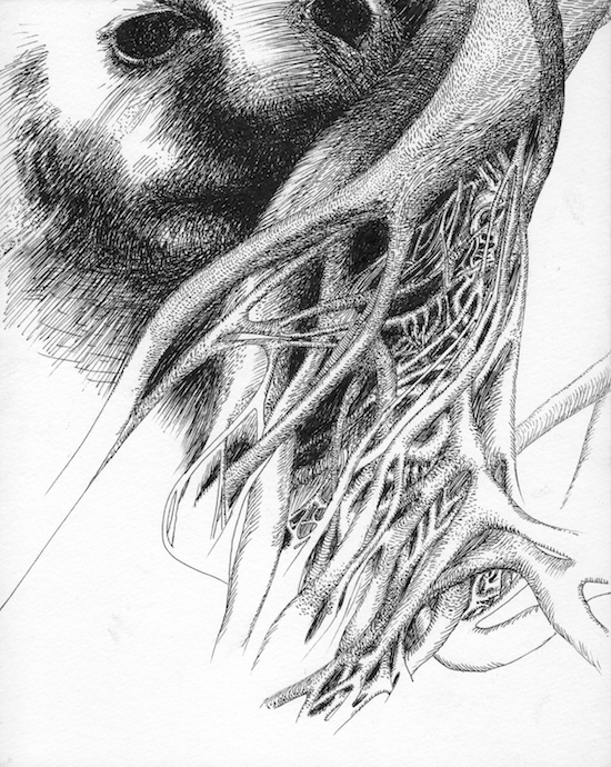
Integrating life and art leads to odd juxtapositions. I don’t know how long I’ve spent staring at the olive trees on my lunch break–the twisty roots, and sensible pruning–and learned to “see” them from drawing.

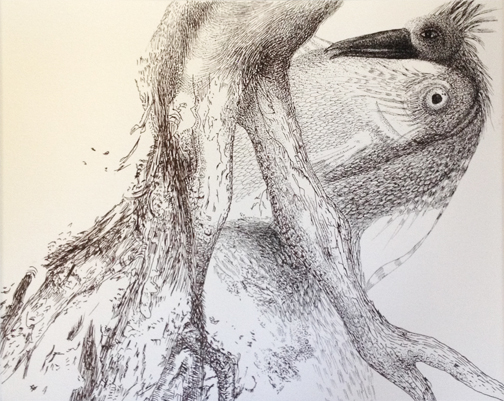
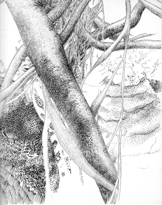
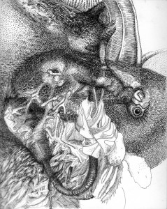
Let me show you the olive tree  from my office park:

whale, pen & ink Seana Mcnamara

Did you notice the whale?

It’s the best part, but it wouldn’t have happened without the olive trees.

Let me show you how it got there.

How The Whale Joined The Olives

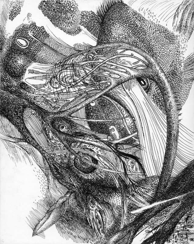
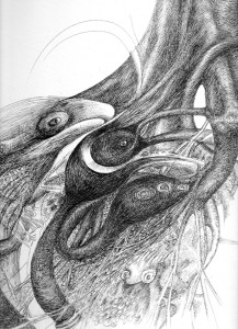
Three years ago, Richard Boyle, a scientist who studies “the ear in space” gave me cross section photographs of the little pockets of hairs in the inner ear.  My initial drawings looked like tiny wrigley stalagmites, and I put them everywhere.

I drew those hairs so many times, and so many places they didn’t fit, that they stopped being patterns, and started to become tube worms, and anemone arms.

Then the fish appeared.

grouper Mcnamara 2.2014
Grouper, pen & ink McNamara 2014

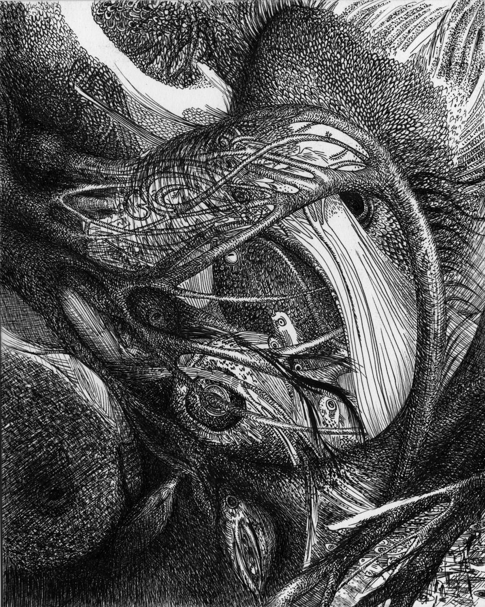
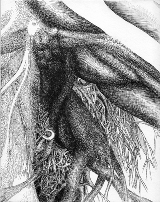
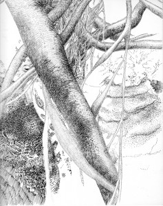
I got a new job. At my new job, I quickly began to choose my parking spots based on the view. Which olive tree had the knobbiest roots? And, for a bit of practice, I drew olive roots at lunch.

When my olive roots were no longer exciting, I slid the work to the end of the stack of “work to do” to protect it from the wastepaper basket. In the meantime, I drew, with no composition, sketches of things I saw, on a piece of paper I was reluctant to change while white still remained. Here it is in its early stages:

Sea Creature In Progress

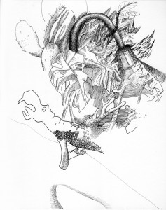
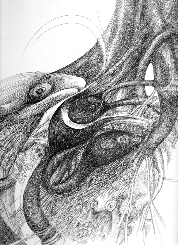
Sea Creature In Progress, Seana McNamara, October 2013

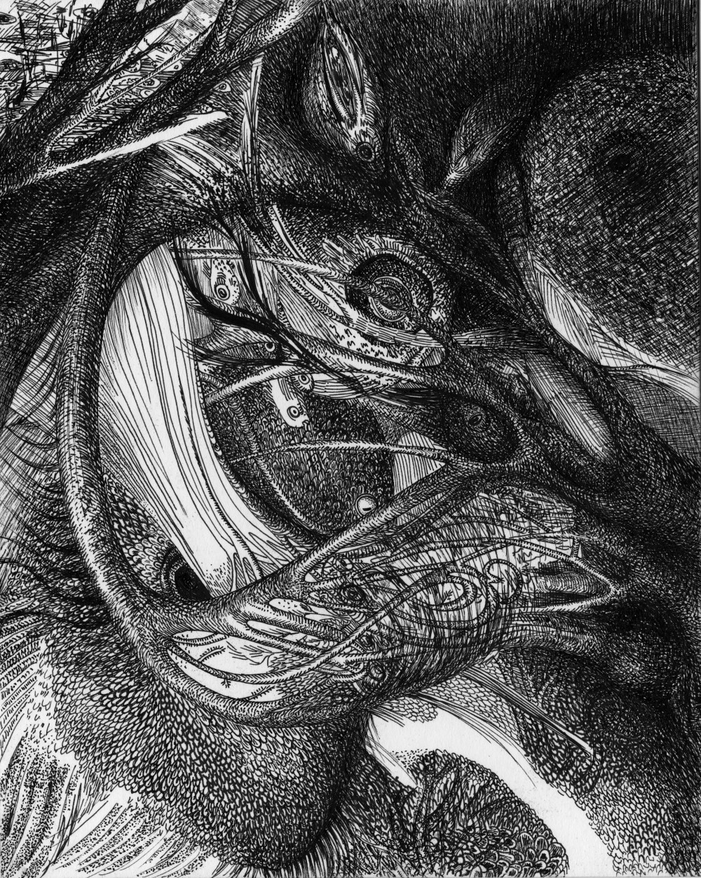
Notice the hippo figurine, the desk lamp, and the houseplant?

It became this:

sea-creature-mcnamara-2.2014

Sea Creature, Seana McNamara, February 2014

The “stuff” now has character. They’re creatures I’d like to meet.  From the top left, a newt like creature is swimming into the frame and in the middle, a large jawed creature with a small eye is doing his best to turn into a piece of coral. Why not?

My newt, sea creature, and coral combination had enough life that I accepted that my ocean creatures could exist in their own right. So,  when two lines and a few scribbles on my olive roots reminded me of a whale, I was willing to run with it, rather than shelving the drawing.

Ideas that appear spontaneously are worthwhile. Most of us accept evolution in science, and most of us don’t discount how well put together a bird looks, just because the depth of his beak wasn’t a premeditated decision. (Must have a bigger beak now!) The bird is a coherent whole, even if his anatomy developed piecemeal, over the lives of many many birds. It’s the same with ideas in art.

If I were to create work that was just for me, which no one else ever saw, then creating a visually arresting object would be enough. But as soon as I show the work to someone else, they want a logical context for the work. Not that logic wasn’t at work before, it was just logic over time, iteratively, a very different kettle of fish. And no one’s interested in dealing with lots of little fish, when they could have one large fish instead. Why have several tangential explanations, when you could have one? So out comes the fish compressor and hopefully what results isn’t the pacific equivalent of a meal of compressed chicken (my feelings when reading artist statements).

But Where Did Your Idea Come From? It’s not that the person asking the question really wants to know where it all comes from–they just want a compass to get their bearings. From my point of view, they want the biggest arbitrary decision, from which all other decisions flowed logically. The premise.

It started with an ear.

facebooktwittergoogle_plusredditpinterestlinkedinmail

Transform Life into Art

The art that most inspires me is art that keeps me so busy looking, touching, and experiencing, that I forget who made it.

The Kiss, by French sculptor Auguste Rodin, is a great example.

The Kiss Rodin

The Kiss, 1886, by Auguste Rodin. Photographed by Philipp Weissenbacher

Artists’ Lives Shape Their Art

Once I re-emerge from a great work, I puzzle my way through it, to understand intellectually how it worked emotionally, and learn more about the history of the work. Having exhausted my own bookshelves, I’ve been reading far too many wikipedia biographies of famous people– Antoine de Saint-Exupery, Lewis Carroll, Maurice Sendak (who wrote Where The Wild Things Are), and Rudyard Kipling.

Accidents of Biography Inform Art

It’s hard to ignore the way accidents of biography inform the finished work. Saint-Exupery’s plane crash shows up in The Little Prince. Carroll’s love of wordplay and math show up in the Alice books. For the operatic adaption of Where The Wild Things Are, Sendak named each of the monsters after his aunts. And, as for Kipling, India keeps reappearing.

I’m drawing on fairly well-known examples here, but I think the clarity of the example illustrate how non radical the concept is.

Reading Backwards – from Art to Artist

The concept of biography informing art gets dicy when it becomes my own life, and my art. With the myth of the suffering artist locked in the garret, I’m under the impression that other people will be looking for these tendencies in my work. This makes me alternatively egotistical and self conscious. (Maybe it’s the same thing).

If the painting’s black: What will they think? Are there too many fantastical, unhappy creatures? Is it just me deciding that the creature is unhappy? What’s on the page, and what’s in my head?

While most of this is pointless thought, the lack of objectivity is problematic. If I can’t see what they see, I have no chance of seeing the finished work.

I’ve resolved to DO The Work First and stop worrying about it to the best of my ability.

This goes for most things.

facebooktwittergoogle_plusredditpinterestlinkedinmail

Making A Character Lovable

So I’ve been trying to figure out how to pace a story (and what to leave out and what to put in) as my brain jumps from one image to another and gets caught on inconsequential details like “why didn’t the man eat my creature.” Some of my questions strike me as rather important. Such as: how should my creature communicate? And to whom?

This leaves me with the overwhelming problem of trying to communicate my love of a creature who doesn’t exist. It’s a bit like being a parent but worse, because I find it hard to communicate his strong points.

My Creature’s liabilities:

  1. He can’t talk.
  2. He likes to eat things on sight.
  3. He tends to avoid others of his own kind ( see point two)

You understand my problem? He’s unlikely to eat you, my dear reader, safely protected by your monitor. He lives in the water, and you on land. Plus, he has a fondness for king crabs and mollusks.

He’s not a creature from the black lagoon, even though others of his kind have been slurred with similar descriptions. And while I don’t understand him–they–the scientists don’t either. He’s alien. He thinks with his legs, and tastes with his skin.

My character is like a misplaced crush

My character is like having a misplaced crush. I can’t explain why I like him. And it’s irritating, because I want you to like him too.

I can point to the cool things that he does, but his liabilities seem so overwhelming that it’s hard to conceive of him as having friends. Loner really isn’t a cool word, although it probably best sums up his lifestyle. Perhaps we’ll go for independent, hmm?

For now we’ll stick with “because I say so” when I tell you that he’s brilliant, and clever and smart and . . . he’s a bit of a mystery, my creature, with only highlights of an adventurous life.

facebooktwittergoogle_plusredditpinterestlinkedinmail

Reading Up on Comics

Comics is a media I know nothing about. zilch, nada…At any rate it’s been something I’ve been looking into because many seem to be targeted at adults, while traditional storybooks seem to be for the eight and under crowd. I know I want to work in picture format, which means that I need to look at traditional comics, if only to know what I’m choosing not to do, as it seems to be the current iteration of story + pictures + not moving.

So, I’ve been scouring the internet, for images and stories that I like, to see what precedent there is. So far, indie European comics are closest in style. I’ll link to them if I happen on another I like.

Badger and roots pen drawing

Pensive Behind Roots
Pen, 2013 Seana McNamara

facebooktwittergoogle_plusredditpinterestlinkedinmail